Hey party peeps!
I’m partied out right now. ;p Don’t worry…it’s only temporary. I just got done with my sister’s bridal shower and I can’t wait to show you the pictures. I needed a night to catch up on sleep…so the pictures are coming soon, along with some really fun tuts (as in tutorials).
But…I wanted to go off course a little and show you a wall art idea, as well as get your interior design opinion. A couple weeks ago, I was talking with my friend Jenny (from Vivian Elle Invitations) and we were talking house decorating. She has the MOST adorable house and great taste, so I love when she shares pictures of the decorating progress (her and her husband just moved in…maybe a year ago). I was sharing with her some projects I was working on and she recommended I share them with you. HOWEVER…BIG DISCLAIMER: I am not an interior decorator. I have no idea what I’m doing. I just take cues from my favorite home decor blogs.
So…this is experimental. Let me know if you like these posts thrown in every once and awhile or would rather just keep the party stuff churning.
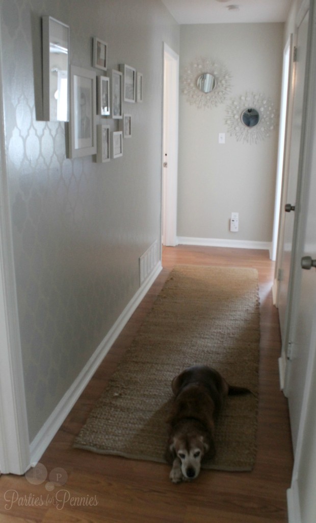
This photo bomb was probably meant to be a message, “Mom…I really could use a belly rub.” ;p
If you’ve been reading this blog for awhile, you may remember when I (with the help of my friend Kareena) stenciled one of the walls in our hallway. I have, since then, began to gather pictures and art for our gallery wall. This is like the mini candy bar version of what I hope it to be.
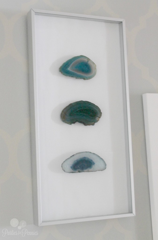
When Mike and I went to Colorado for vacation, just before Christmas, I brought back one souvenir. Technically, three. We went into a gem shop and they had the agate stone for $1.50/each. Agate stone is all over with home decorating right now. I’ve had some agate stone bookends on our bookshelf for a couple years now but I wanted one more item to add to our home. I bought three stones, with the intention of making some art for our gallery wall. Here’s my Agate Stone Art…
It worked out perfectly because I had already purchased this long shadow box frame from Goodwill 2 years ago. I simply cut white cardstock out the length of the frame, added my own diy mounts (basically white cardstock doubled up) and glued the stones on top.
I LOVE how they turned out! What do you think? The total amount I spent was $6.50 (with the frame and stone).
Okay…here’s where I could use your help.
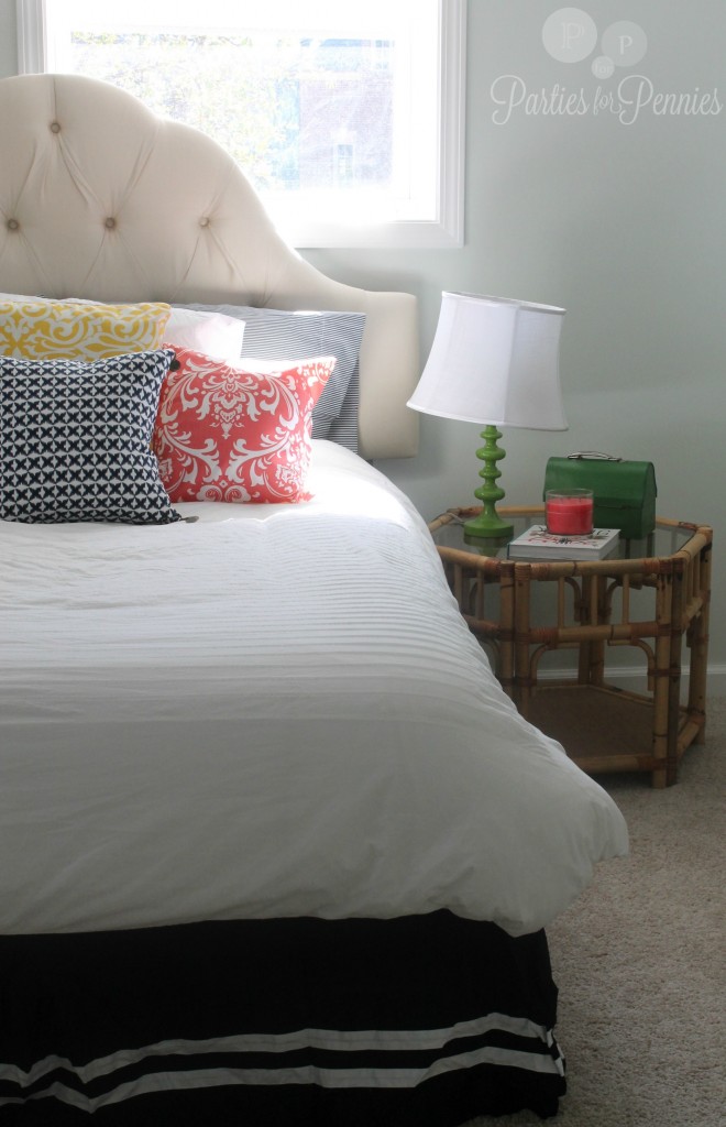
This is our downstairs guest room. We just finished our basement last year and have been slowly trying to furnish it. I wanted this room to be very colorful and cheery. The wall color was called bakers dozen and it looked white on the swatch but when we slapped it on the wall, it turned out to be a really light mint green. Is that what “bakers dozen” infers?
Basically…this room has window shades (that Mike is making me get rid of ASAP…they were cheap & they work REALLY cheaply), a bed and a side table. That’s it.
That side table I got from Goodwill for $15. I was thinking I’d paint the legs and base gold. However…the more I see it in the room, I kinda dig the original bamboo. What do you think?
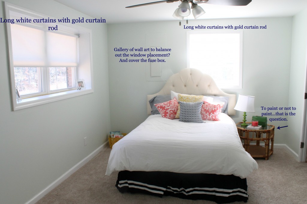
This is the full view of the room, along with things I have planned. Here’s where you come in…
– Should I paint the side table or leave as is?
– What do you think about the wall art gallery to the left of the bed to balance out the weird window placement?
– Any other ideas??
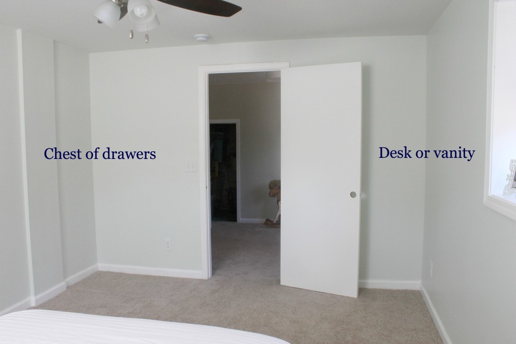
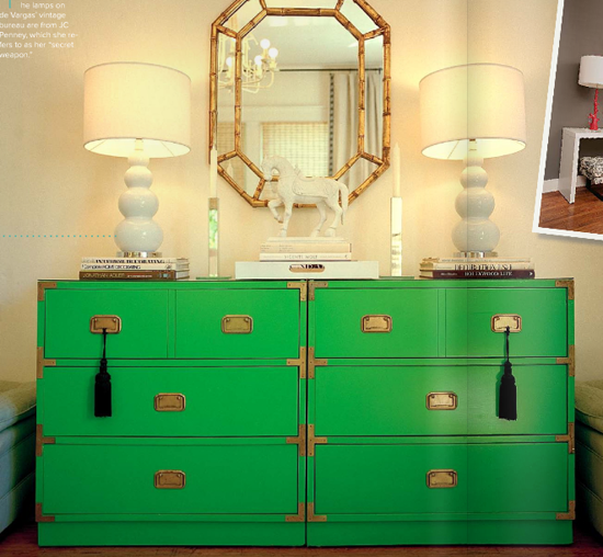
Here’s the other side of the room. I was kind of imagining a chest of drawers like this green one below.
Jenny from The Little Green Notebook DIYed a piece like this that turned out great. I have been on the lookout for a chest so I could follow her tutorial.
As far as the vanity or desk, I’m thinking a vanity would be best, since you have to walk down the hallway to the bathroom. What are your thoughts?
Thank you guys for any input you have, I really appreciate it. And…PLEASE let me know if you like these kind of posts thrown in every once and awhile, or would prefer to deal strictly with the party stuff.
Coming SOON (as in a couple days): A fun Valentines Day printable card for your kids AND all the deets on my sister’s bridal shower.
Until then…you know what to do…
Party On!

p.s. This is YOUR official invite to the party… on the PartiesforPennies facebook page! Click here.
Linking Up To:
UnCommon Designs Blog (Monday Funday Link Party)
DIY Show Off Blog


I would paint that cute little table in a bright pop of color, maybe a yellow or green to match the dresser you’ve been eyeing and change out the glass for a mirrored top for some added bling. And I think to help balance out the windows, you could try angling the bed in that corner instead of having it off center of the window. I also think a pretty patterned (maybe a damask or other bold print) would look better on the windows than plain white. Like you said, the room could use more color and that’d be a great way to do it.
Thanks Tish! I didn’t think about going with a bright pop of color for the side table. Great idea! We did try angling the bed. We have tried every single angle and this was the ONLY one that worked. The room had to be built around some metal poles, used for support, so it ended up to be smaller than we wanted. 🙁 Thanks soo much for your input! Hope you have a great day! <3 Heidi Rew
Why not try the bed in the corner! With that tall headboard, it would balance the two windows. And you need a taller lamp on the bed side table. I like the idea of painting the table a bright “pop” of color. Match the chest of drawers when you get that. Vanity sounds great, too.
Jeanne…we actually tried that, as well as every other placement…including the center of the room. ;p HA! The room is so narrow so every other position cut part of the room off. I completely agree with the taller lamp. I just had that one on hand. Do you think one with a rounder base would look better (almost like a tear drop)? I love the pop of color idea for the side table. Thanks so much for your great input, Jeanne! <3 Heidi Rew
So I’m weighing in on the wall behind the bed. In my favorite KnockKnock, it’s Nate – from Oprah, there was a home in Beverly Hills that this lady had really done so well. Her bedroom had just an odd window so she put a curtain wall basically. You could do that, or tons of fabric both sides and just cover some of the left side of the window since you do have another window in the room. It would showcase that headboard, which i love. Here’s a link to the image: http://www.oprah.com/oathome/Mix-and-Match-in-Beverly-Hills/4. You’ll have to tag me when you do the wall so I can see what you settle on. I love this post and yes you should keep em in the mix.
LOOOVEEE this idea. I hadn’t even thought of that. Thank you so much, Mystie! I’ll definitely let you guys know what I end up doing. Thanks, again! <3 Heidi Rew
left side being a relative term. left if you’re in the bed. right if you’re looking at it.
I like the table with the bamboo, but I think it is dwarfed by the bed a bit, and it could afford to be a little higher. I would put casters on the legs. You can buy the round ones or just use blocks of wood. And to get that color pop, try to paint the casters. It would be fun to do something with a really high gloss so it looks like the casters are metallic. Just another idea to beat around. Good luck!
I think you’re right Tonya and oh my goodness do I LOVE your idea!!! It’d give it the “dip” effect. Thank you so much!! <3 Heidi
Love the agate art! Can’t wait to see what you do with the guest room, I am sure it will be fabulous!
Take care,
Trish
Thanks Trish! Love all the new stuff goin on on your blog! Are you guys going to Haven this year? <3 Heidi Rew