Hey party people!
I wanted to share our kitchen makeover with you today.
Before I begin, let me give this disclaimer: I am not an interior decorator. In case you think this is the worst thing you’ve ever seen in your life, I just wanted to lay that out there.
I know this isn’t a party post but it certainly deals with entertaining. See, we own a ranch that was built in the 60s. That means that everything is a lot smaller than newer homes – bathrooms, closets (oy!), bedrooms, living rooms, etc. BUT we do have a big yard, which is a huge plus since most homes close to Atlanta don’t have a huge yard.
Already, this house has held some really special memories in the 2 1/2 years we’ve lived here. Mike proposed to me in the house, right after he purchased it, in front of 35+ friends & family members. Then we held our wedding reception in the backyard, hosting 100+ people! And of course, we’ve hosted many parties since then.
We’ve slowly been working in phases transforming it to a home we love and our latest phase was the most fun for me!
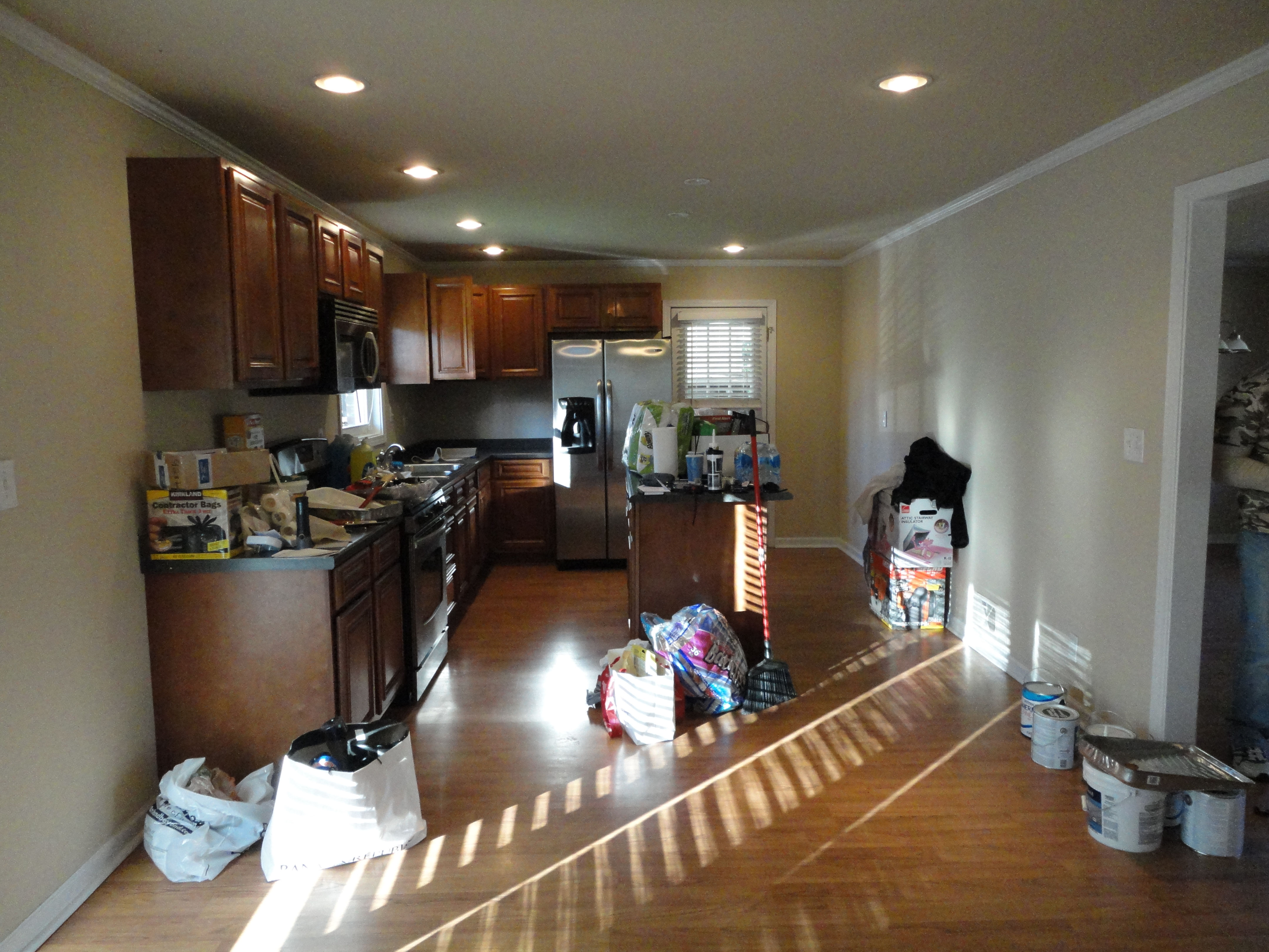
This was the kitchen when Mike first bought the home (he hadn’t proposed at this point so I wasn’t sure I’d be here in the future or not). The previous owner had already done a lot of work to the home, so this kitchen wasn’t too old but the countertops were laminate, there was NO pantry and the cabinets weren’t super high quality.
Do you see the wall to the right in the picture above? That is the wall that separates the kitchen from the living room.
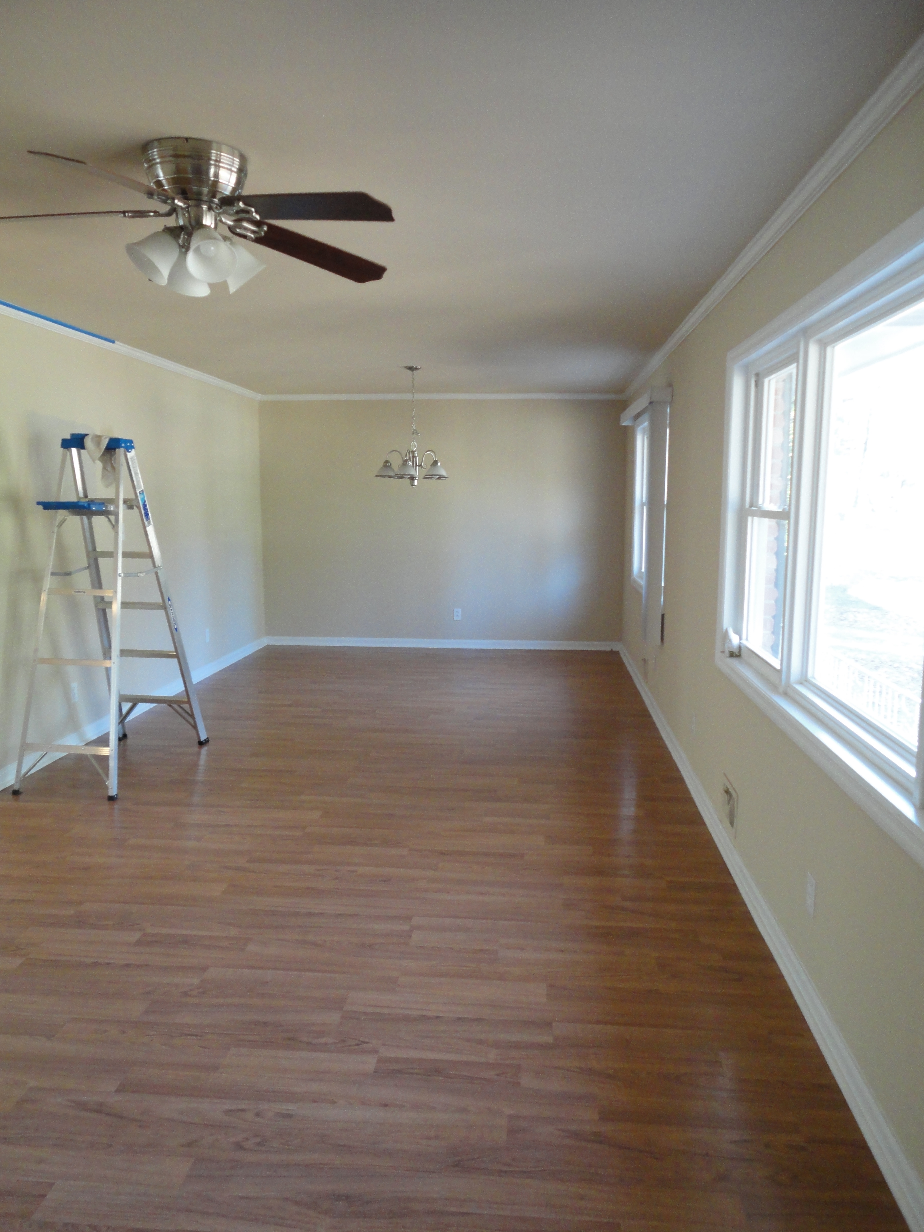
Here’s the living room right after we bought the house.
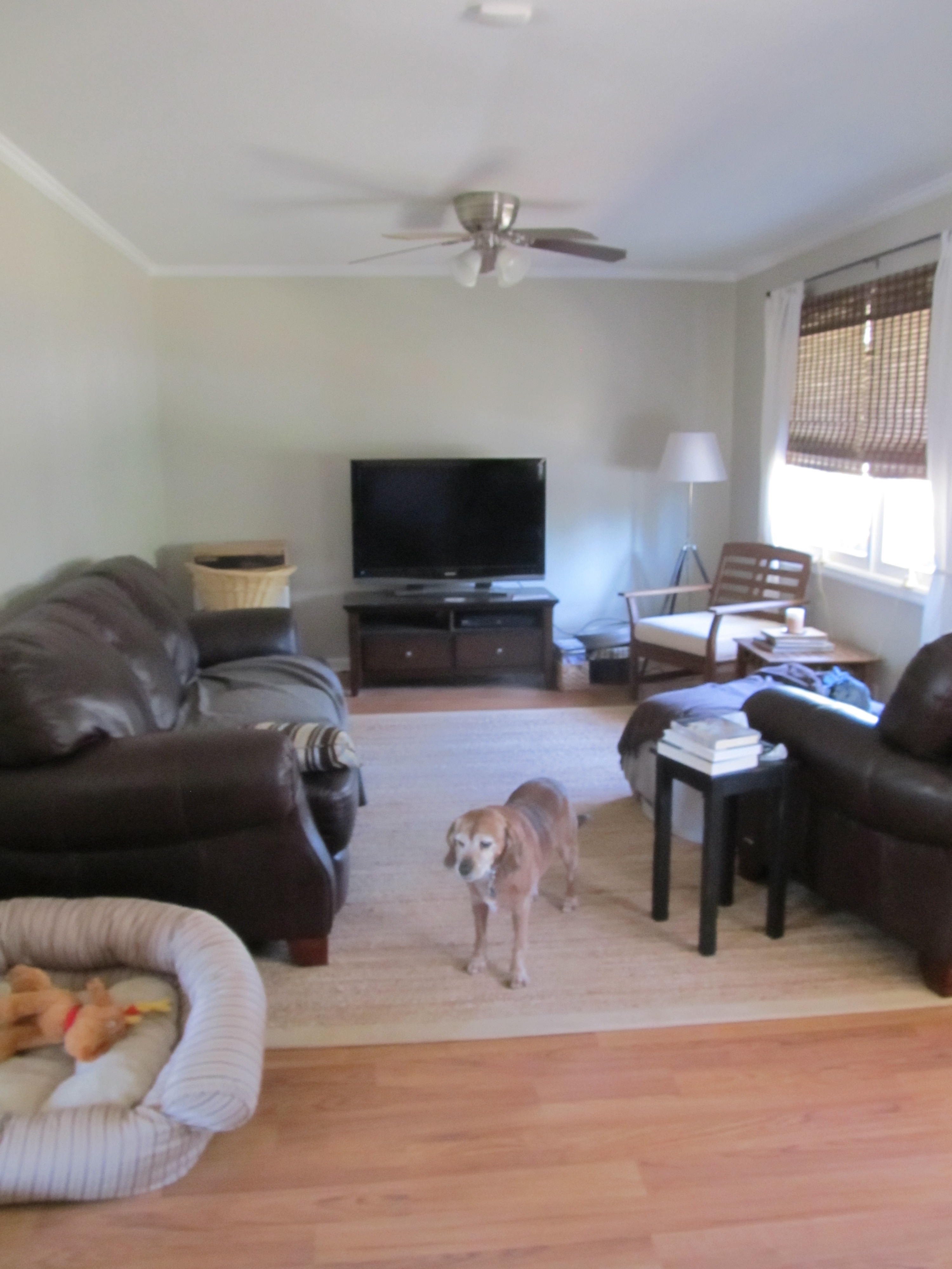
This was the “progress” shot of our living room. Not sure if you can actually call that progress but it’s painted & there’s furniture. It’s really narrow so it was tricky to figure out the set-up.
When we’d have people over, I hated the fact that the kitchen wasn’t open to the living room. Our overall plan was to make this space easier to entertain in and more open.
This phase included all of these things (remember this was over a 1.5 year process):
* Painting the living room & kitchen
* Opening the wall between the living room & kitchen
* Adding granite countertops
* Adding a backsplash
* Adding an additional peninsula to the cabinets
* Figuring out a pantry solution
* Painting the cabinets
* Adding hardware (there was none on the original cabinets)
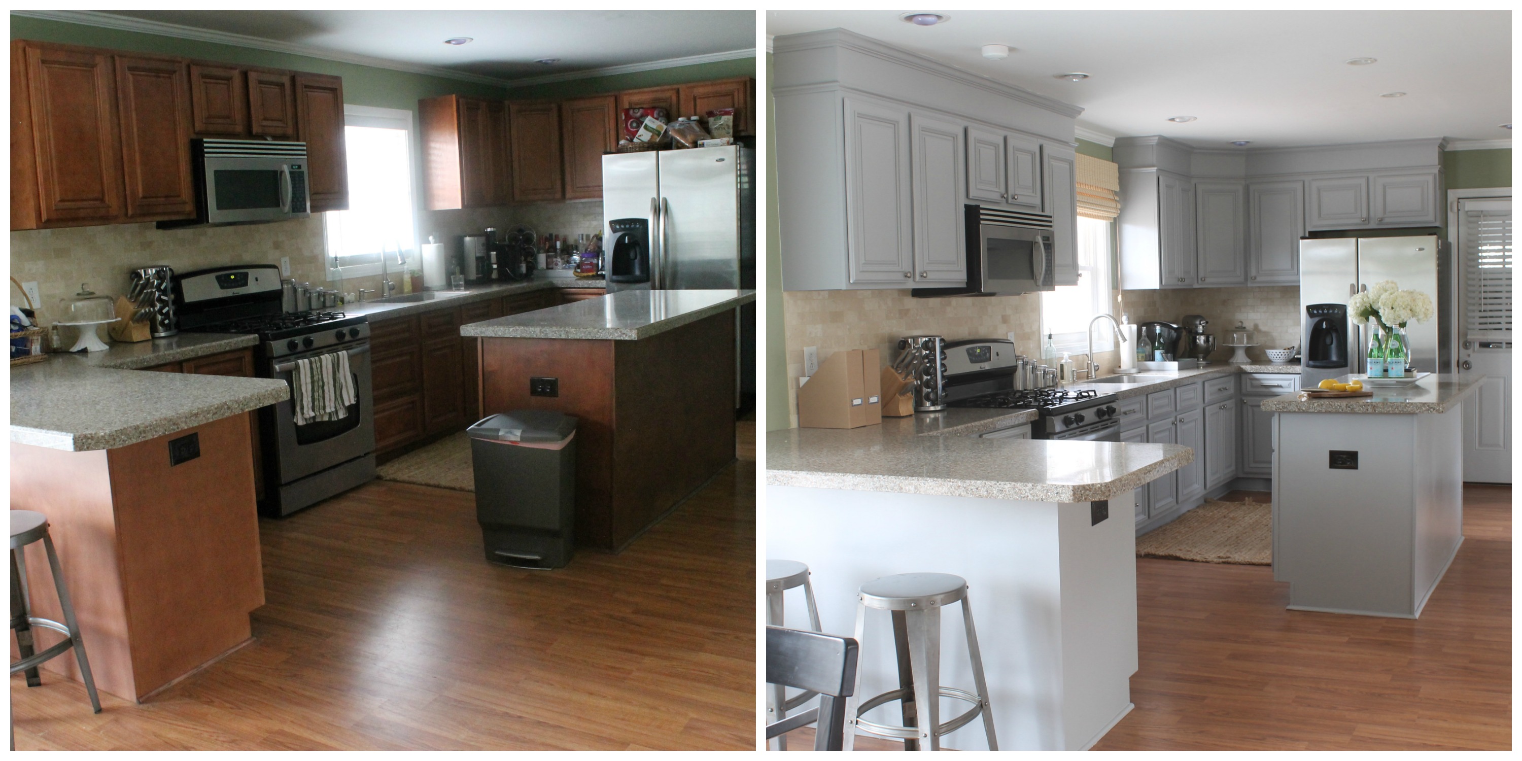
Granite Transformations did our countertops & backsplash. Sorry…we aren’t the Home DIY bloggers. 😉 If there’s something we CAN do that would take a weekend, we will probably attempt it. If it’s not, we try & hire it out. We are both just super busy so we always have to weigh the time element when contemplating those things.
Our contractor, Jackson Moore, added the peninsula, opened up the wall, added the molding to the top of the cabinets, and created our pantry for us!
We painted! 🙂 We painted the walls and the cabinets.
Thanks to my friend, Kristin from The Hunted Interior, the cabinets were much easier! She let me borrow her spray gun for the cabinet doors and she gave me a great tip. We weren’t going to be able to sand the cabinets because they had all these grooves in them. Kristin said to just get some really good primer and we should be good. That’s what we did. We used GRIPPER primer and it has worked really well so far.
I cannot say that this project was not without a freak out moment! My husband painted the main parts of the cabinets, while I sprayed the doors outside. He finished the island & when I saw it I freaked out! I just wasn’t sure if I really liked the color or not. It seemed to have a blue tint in it & I just did not like that. What did I do? I texted my friend Michelle, of Iron & Twine, freaking out! She was such a great friend & talked me off the ledge of home improvement suicide…maybe even saved me from marital issues (Mike would not be too keen on repainting it all). After all was painted, I really do like it. I knew I didn’t want it too dark of a gray so this works great.
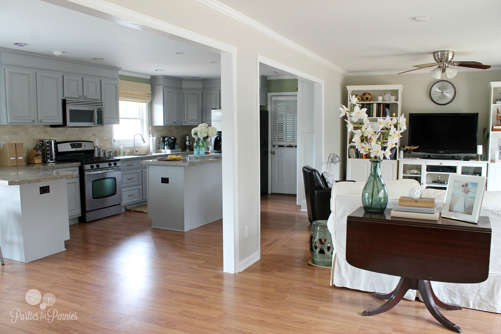
It’s amazing how open it feels by taking out a section of the wall!
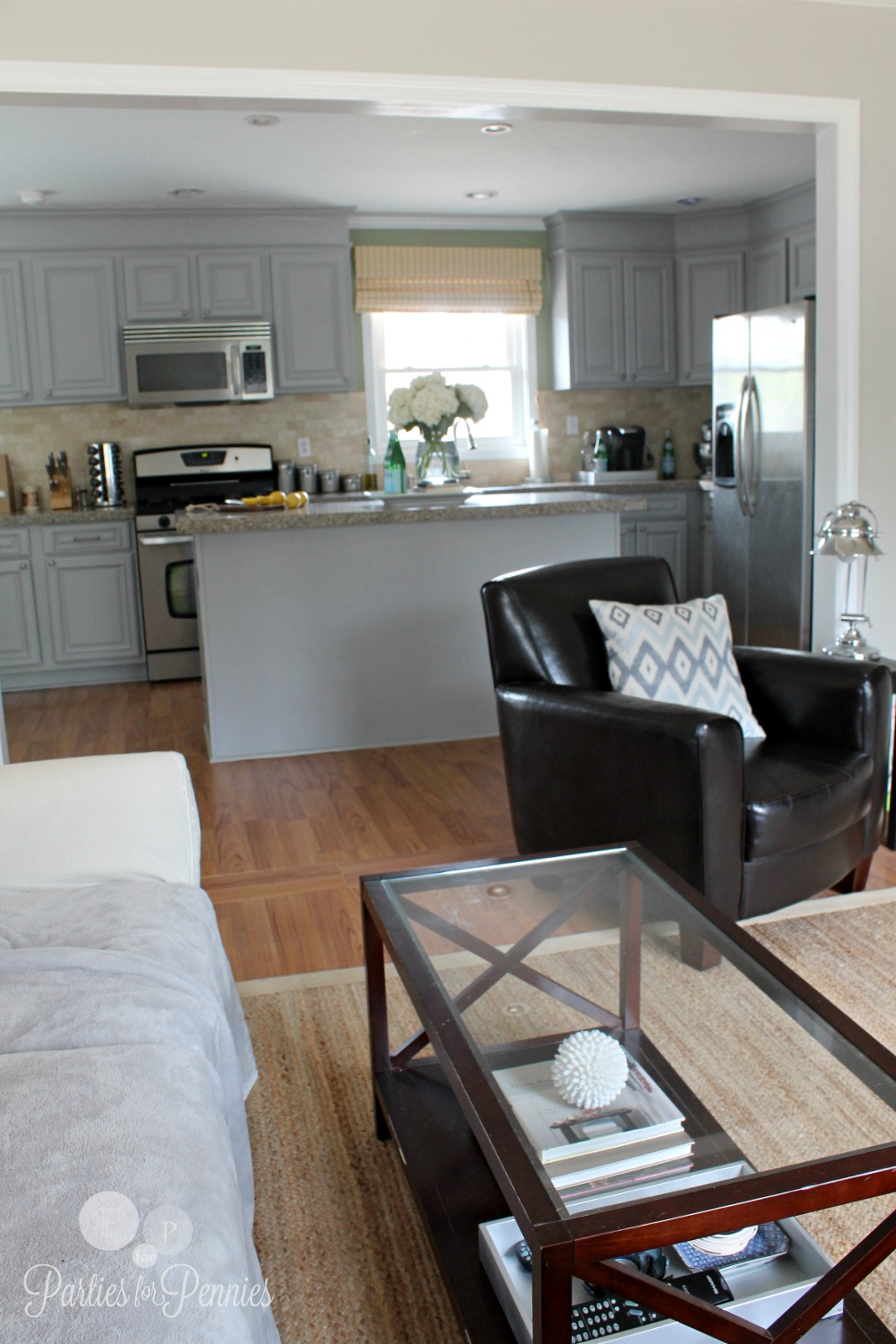
I love being able to talk to Mike while he’s watching Netflix and I’m prepping dinner. Or yell at him to bring me a glass of wine while I watch the Bachelor! (Kidding)
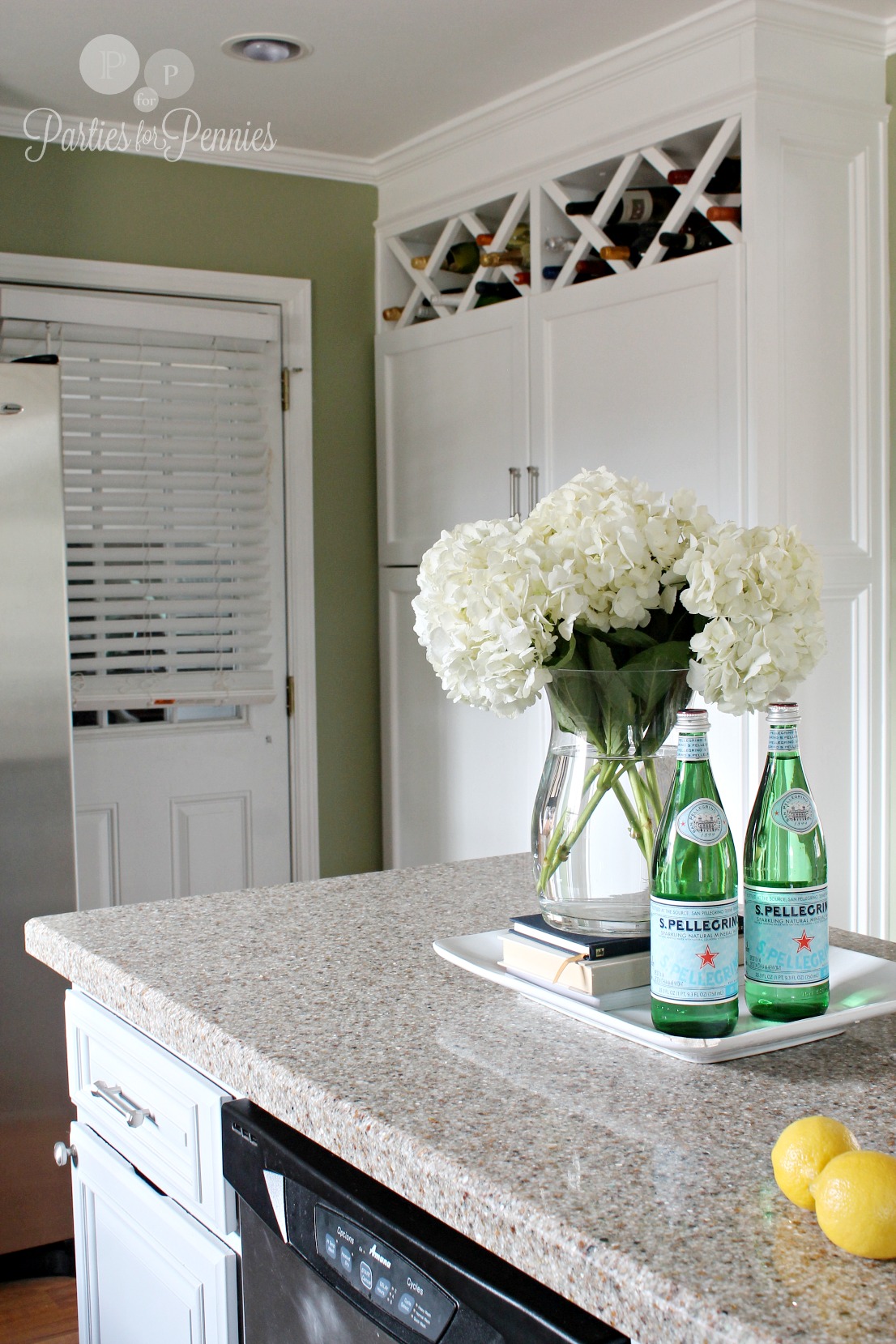
One of the things I’m MOST in love with is the pantry! Jackson’s guys built that and I got to design the inside. It is glorious!
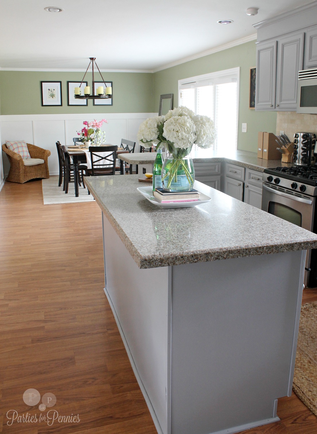
This is the view across to our dining room. We’re still on the hunt for a sideboard or buffet.
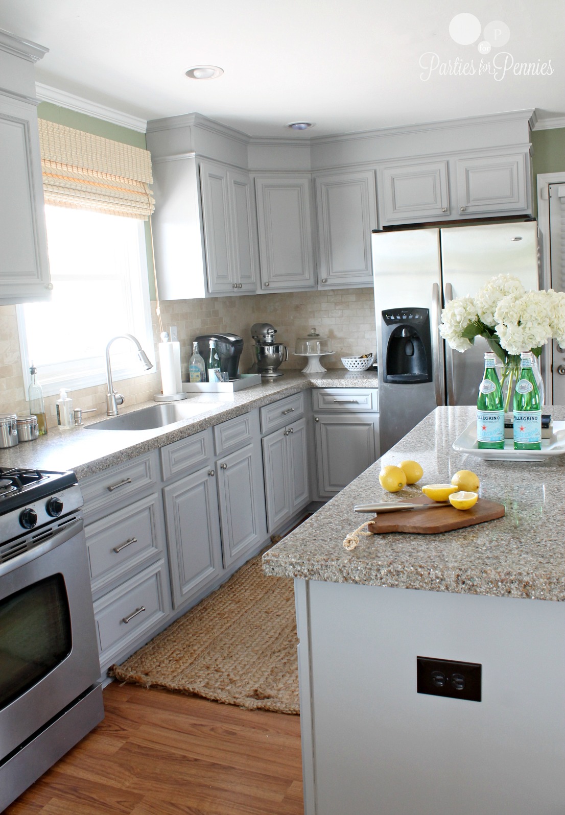
The hardware we got is from Lowe’s. The longer handles are here and the smaller ones are here.
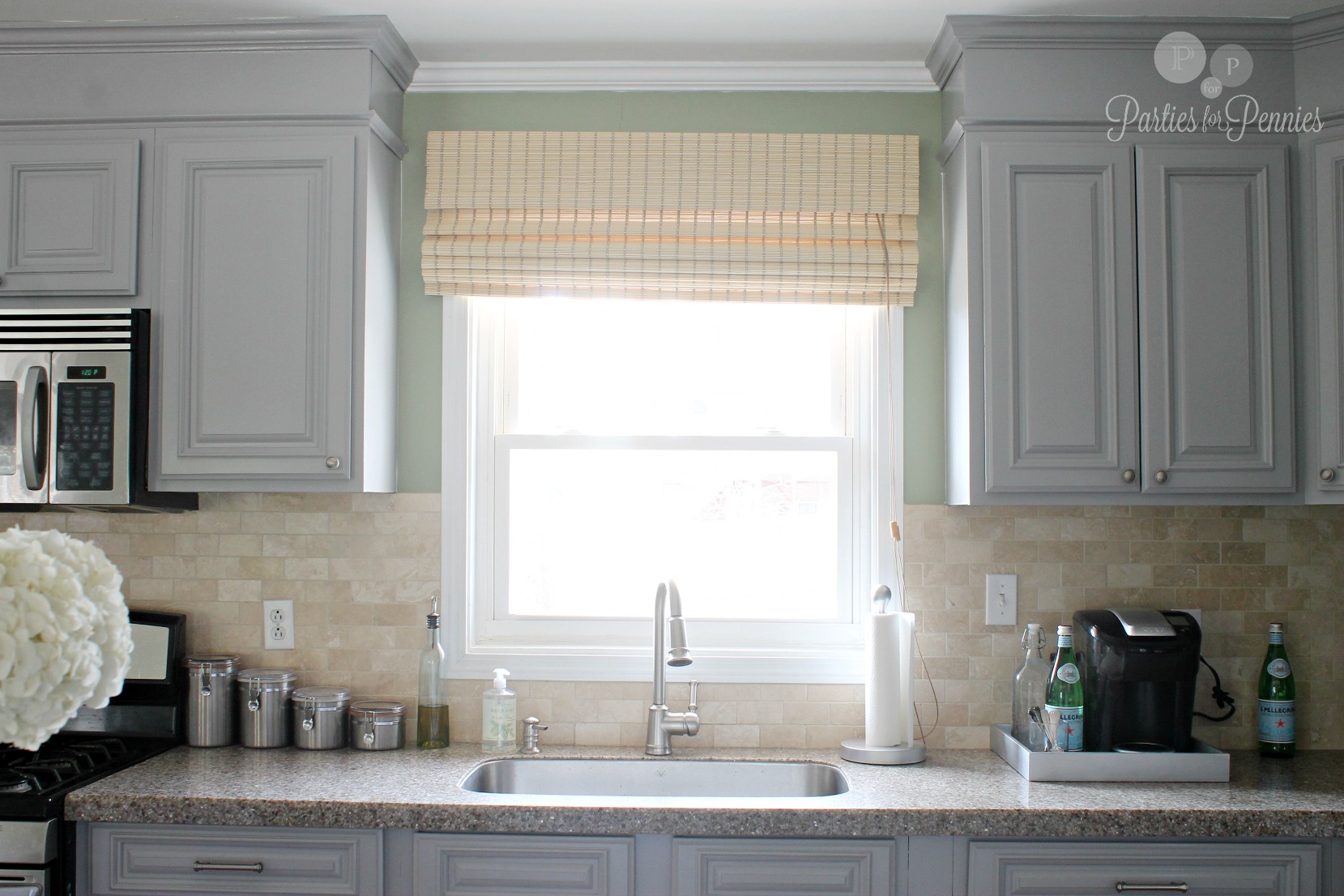
This is the only thing I’m not sure about. I ordered these blinds but now I’m not really digging them. What do you think? I think maybe a white roman shade with a dark gray ribbon outlining it would be nice.
All in all, we love our new kitchen. I know we didn’t DIY it but my best money saving advice would be to take things in phases and be patient.
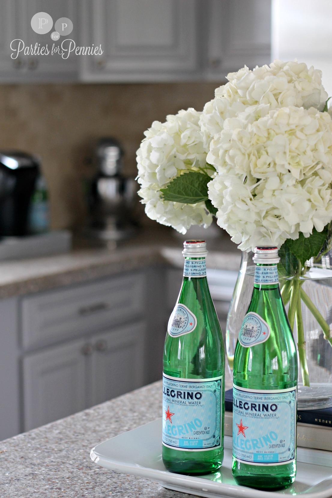
…And add flowers! Flowers always make things better!
Now, I’m ready to throw another party!
Are you working on any house projects right now? Isn’t it hard to be patient some times?

p.s. This is YOUR official invite to the party… join in on the Parties for Pennies Facebook page, Twitter, Pinterest, Instagram & Bloglovin!



Beautiful! I love it! Can you post pics of the inside of your pantry? That is my favorite part too!
Thanks Audrey! Yes!! I need to. I almost did but I’m about half way done organizing it! I got some great storage jars from Hobby Lobby at 50% off but need twice as many so I just need to go back & get more. I’ll try & do a post with the inside too! I am so in love with it! :p <3 Heidi
I love the transformation! Your kitchen and living room look way more refreshing. You have such a beautiful home! 🙂
Thanks Nicole! I just love it being open! It lets more light in too, which makes it nice! <3 Heidi
Looks so good!!! You did a great job!
ps. you could be an interior designer!!!
Aww…thank you Katie! You are too sweet! <3 Heidi
LOVE HEIDI!!! So pretty and light – love those hydrangeas on the counter!! Awesome transformation
Thanks so much Danielle! <3 Heidi
It looks wonderful! I love the gray, the “to the ceiling” cabinets, and the openness. For the window, I definitely like the idea of a Roman shade, but would recommend a printed fabric. Here are a few I like: https://www.fabric.com/buy/bi-028/amy-butler-midwest-modern-optic-blossom-linen
https://www.fabric.com/buy/0284188/richloom-solarium-outdoor-zinger-sterling
https://www.fabric.com/buy/um-268/premier-prints-gotcha-twill-storm?cm_vc=756b1813-cbc1-43b3-84bd-29889bf8fb7b
I also recently saw a DIY tutorial on a no-sew roman shade using an old set of mini blinds…
Good job!
Love those! The Amy Butler print is fab! Thanks Liana! <3 Heidi
It looks wonderful! I like the gray, the “to the ceiling” cabinets, and the openness. As for the window covering, I also like the idea of a roman shade…how about in a printed fabric? Fabrics.com has some great choices. I can’t post the links here, but I like Amy Butler’s Midwest Modern Optic Blossom, Richloom Solarium Zinger Sterling and Premier Prints Gotcha Twill Storm. I also recently saw a DIY tutorial for a no-sew Roman shade using an old set of mini blinds. Again though, Good job!
Thanks so much Liana! Love your ideas! I think I may also try to do the same thing for the shades over the door leading to the garage. Those just aren’t very pretty. Thanks again for the wonderful ideas!! <3 Heidi
Heidi, I LOVE IT!!!!!!!!!!!!! ALL of it! Including the shade above the window…I think it is a perfect tie in with the backsplash and with the rug in the living room! Y’all did awesome! 🙂
Thanks so much Morgan!!! Love what you guys have been doing at your house too!!! Miss you! <3 Heidi
Love all! Looks like a “Pottery Barn” house! 🙂
Thanks Kim!!! <3 Heidi